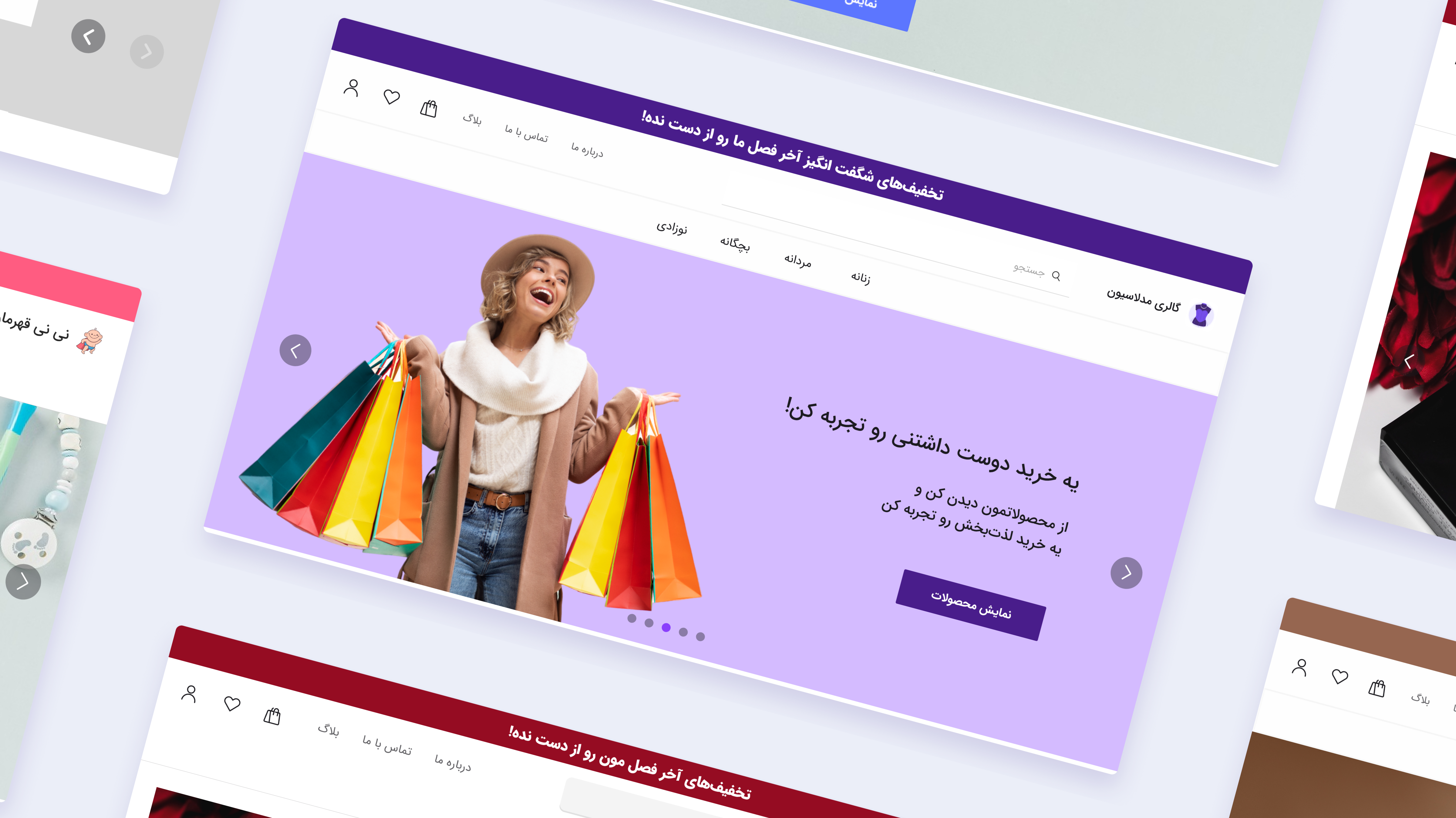

Minimal Theme of Digify
When we started working on Digify, we were creating online stores and some public themes for sellers. After a while, we discovered that most of our customers worked in fashion, so we created a theme specifically for them. In this theme, we designed it especially for a special group of sellers, who wanted to show off their products in the clearest way possible. We consider different needs on it and make it customizable, so any seller can make it look different.
Client
Digify
Service
UX Research, UX Design
Date
April 2, 2022
Challenge
One of the most challenging parts was that we needed a theme to be suitable for different tastes and online shops in the Fashion Group. It was important to provide the most customization with a minimum effort for the client and development team.
Solution
User research revealed the top priority for our target users was presenting their products clearly. Most users had few products but invested in high-quality photos. Therefore, I designed a minimalist theme centered around large product images. This allowed sellers to showcase their items attractively. The image-focused pages gave each seller a unique site.

It has a dark and light theme. Varies of color palettes are designed, but sellers who have a color brand could use their specific color scheme. For any section of this theme, I designed about 3 or more customizations to support different scales of sellers. I’ll put more details about it here soon…
